Tuesday, 9 March 2010
Filming
We anticipate to be filming our new scenes quite soon. We have planned exactly where we will have the car driving, what shots we will be using, what dialogue there will be and what each character will be doing. We still have not yet decided upon the song that we are going to use in the car scene. We have decided to use a normal family in the car (My (steph's) family) all doing what is typical of their age. We're hoping the general "normal" vibe you get from these scenes will create a huge contrast between the car scenes and the running scenes therefore creating a sense of foreboding, and making the audience curious as to what is going on. We hope to be able to put this altogether soon! :)
Friday, 12 February 2010
Media Changes
We have had to review over our Media Coursework and remove some filming and replace it with other scenes for the genre. Although we thought that the story was convincing and sound and editing were used well, we realised that our opening lacked the suspense that a film opening needs and acted more along the lines of a trailer. To stop this from happening we have decided to include a car scene to juxtapose normal lives against that of the girl that plays the victim. Then we can see a definite contrast between the characters and have for pity for the victim.
We also think that by using this in our opening we can have the suspense of whether the victim gets in the car? and does she recognise the passengers? leaving the audience with questions unanswered and a story that could progress if it were made into an entire film.
By adding in this extra footage and changing the storyline slightly we feel it will improve our narrative and give the audience a better understanding of the storyline and a bigger feeling of suspense.
Sunday, 31 January 2010
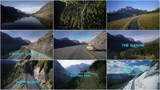
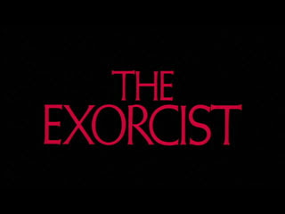
Fonts for titles and credits
Analysing psychological thriller title fonts:


The most common title fonts in thrillers or horrors we have noticed are red and black. Therefore we are planning to stick to the codes and conventions by using a mix of the colours or of just one of them.
We want to use a dark horror like font. Some examples of the fonts we are considering are:


Filming
This weekend we managed to do our filming for our media coursework. We began filming at around 3:30 and it got dark very quickly therefore making us under a difficult time limit to film. We began with the pan shots of the surroundings which we are planning to use right at the beginning of the opening and towards the end. We struggled filming the pan over the top of the fence but we managed to use another area in which we could film without the fence in the way, and we can still use the other pan shot as long as we crop out the top of the fence. After this we began to film the running shots. For this we had Jess hold the camera and run behind Natalie as she ran in a white dress barefoot on lots of ice and cold ground! We maybe did not managed to use as many different shots for the running as we wanted but we managed to still use quite a variety of different shots of the victim running. To film the victim coming into the barn we went inside the barn, as she ran in. We were going to try and film her coming in standing by the edge of the barn, with a shot of the paedophile in the field, a close up of the victims face and another long shot with the paedophile gone in one shot but we realised we obviously could not manage this in one take. To get past this we filmed the victim running into the barn and then decided we would have another flashback inbetween here and the victim standing by the edge of the barn. When she was standing by the edge of the barn we managed to film a long shot with the "man" in the field then a close up of the Victim's face, and another long shot with the "man" gone. After this we managed to have a hugh angle shot of the victim running round hay in the barn. We then filmed her standing in front of the huge hole in the barn wall, when the "man" ran past the hole with the girl looking petrified. We then filmed the hole with the wind just blowing through it - showing that she has disappeared. After this we did another pan shot for towards the end of the opening (we wanted to use a lot of natural imagery juxtaposing the beauty of nature against the nature of mankind). The shooting in the barn was quite difficult as there was a real lack of natural light, but hopefully this will add to the terror of the opening.
The next day we filmed the flashbacks in the stables. We found that we added extra shots but the location and acting was extremely convincing. We made sure all of the shots were high angle so we were looking down on the victim making her look vulnerable. We also had the idea of shutting the bars in the stables showing how trapped she was in the box. We also made sure to record the footsteps and breathing of the victim for digetic sound. We also recorded the ticking of a timer for the flashbacks to emphasise of the change in time.
The make-up and props (fake sick and blood) we used were convincing. The lack of props also made opening simplistic but also realistic. We are extremely looking forward to putting all the shots together and creating the final coursework.
We found that we added quite a few extra shots into our filming as we realised if we stuck to the original storyboard the coursework may be too short and some technicalities made us have to add in extra flashbacks etc.
Location


Our location was set at Natalie's house. A long track was used for the running scenes. The barn was used for where out victim was to hide. The stables were used for our flashbacks.
We found that our location fitted really well with out storyline as the area was quiet, and away from too much civilisation making the area seem deserted. This made the victim look isolated and lonely making her more vulnerable. We found that the stables worked really well as a "chamber" or "prison" for the victim to be kept in. The dark walls made the victim look pale and small fitting the codes and conventions very well. The track worked really well for our running scenes, but as it was very cold and our victim had to run on bits of ice barefoot it was slightly dangerous! (Natalie ended up cutting her toe!). Despite this we managed to carry on filming.
Saturday, 23 January 2010
Flashbacks
Flashbacks are a trademark of SAW movies - in these movies to show that these are flashbacks they are in a slight blue tint, which also makes it look quite cold.
Ideas of how to make the flashback obvious to the audience:
Blurring the scene
Showing the scene in Monochrome
Adding a misty border around the edge
Applying echoes to any digetic sounds
Showing the scene with a grainy effect
Showing the scene in Black and white
Showing the scene with a slight tint of some sort of colour
Films that use flashbacks and how they display the flashbacks:
Wayne's World - uses idiosyncratic wipes (when a film uses strange sequences to move between scenes)
Saws - Different coloured tints with a heavy use of light and dark. (flashbacks were usually darker and harder to see than the present time)
Big Fish - All of the flashbacks include brightly coloured objects and have a slightly glowing effect on characters faces.
Boggy Creek two the legend continues - every flashback slightly blurred.
G.O.R.A - grainy and black and white film.
Trick R Treat - Flashback filmed with a brighter colour pallet than the rest of the film and bathed in golden light.
Wednesday, 20 January 2010
Psychological Thrillers
Top ten psychological thrillers:
1. The Ring
2. Sixth Sense
3. The Blair Witch Project
4. Paranormal Activity
5. The Haunting in Conneticut
6. Gothika
7. Rosemary’s baby
8. The Shining
9. Whatever happened to Baby Jane
10. The Grudge
Subscribe to:
Comments (Atom)